Sunday 21 March 2010

Bio - First stage - Layout Design

As part of the website creation I was delegated with the task of creating the biography page for the main site which would show pictures of the people included in the exhibition as well as short biographies written by each of those involved. I wanted to make the design clean and bold but also conform to the design of the main site which was achieved by the use of the same background and page title.

The hard part to think about was the way in which to display the pictures and bios on the page so that they could be viewed creatively and have enough room to show each person’s own section.


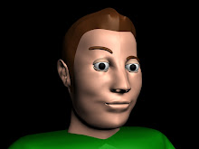
I found the best way to this was to create in Flash, a focal point to display the images alongside their perspective bio pieces, with an underlining sub-visual of each of the people involved in the exhibition. This way all the images would be visible at all times but also each one could be selected individually. Here is the first mock up of the bio page.


You can also notice the logo change between the designs which was a decision made by the team leaders and in my opinion the new logo works better with the design and is more relevant to our theme.

New Website Layout Design


This re-invention of the layout design in my opinion is a cleaner, more artistic take on the visuals needed to portray a design atmosphere. The main body of information will be shown in the bottom right of the display with the title and logo still remaining in their original position. The links will be displayed on the right in the style of post-it notes held on the board background with pins. The font used on the buttons will be in a script style to simulate a handwriting feel. The dates of the exhibition will still be on show but at the bottom instead of top right as before.

The simplicity of this design paired with the use of a strict colour scheme will help be a suitable frame to contain the different styles of work on show in the exhibition.

First Mock Up Design


This was a mock up of a design I put together based on the layout shown above. The design follows all the layout properties of the initial design, with the title at the top and the sponsors on the side which as can be seen, overwhelms the design as previously stated. The design looks alright but I feel it’s too overcrowded and doesn’t follow the theme of the exhibition, which lead to the re-creation of the original design.

Website Design Layout


This was the layout given to me by our team leader and I was given the task to create a layout for the main body of the website. Initial ideas were that the main page was to contain a section for sponsors, the main body of information was to be bordered with the logo design with the title of the exhibition shown at the top along with the contact information. After revision it was decided that having sponsors on the main page was too overwhelming for the design and so was changed to having its own page.

CV Ammended


Following the recommendations made by my tutor, I decided to change the font for the headings on my CV to match those I used on my business cards. I chose to do this in order to create a sense of conformity between the two documents using their fonts as well as use of colour.

Thursday 4 March 2010

CV 2010


This is a copy of my created CV, the main colour scheme is the same as my business card, the green, white and black.
Some initial feedback from people looking at the design say it looks a little overcrowded but I like the sense of displacement in the boxes.
I chose not to include too much information on my CV so that it didn't exceed an A4 page but the information included is sufficient and segmented in such a way that they are easily distinguished from eachother.

Business Card


Here is an idea for my business card, its a simple contrasting design using green and white which appear to work well together. Green is my favourite colour, giving the card a personal touch and 'Sparrow' is my alias which shows my identification.
The slogan 'Conceive Design, Create Art' was something I came up with naturally from searching for existing slogans. I feel it works well without being overloading.

Chosen Design Idea

After pitching all our ideas to the class we had a vote for the theme we would use and the winner was The Design Studio which was to set out the exhibition in the style of a design studio which gave the impression of artists working inside.

After selecting the theme we divided ourselves into three groups
1. Exhibition Team - Responsible for making arrangements regardign physical matters in the
exhibition (i.e. opening times, material, finances etc.)
2. Graphics Team - Responsible for the creation of visual graphics and displays to promote
and to be shown inside the exhibition.
3.Website Team - To create a website and online information regarding promoting the
exhibition and showing information to the general public about the exhibition.

I decided to be part of the Website Team as there was was a short number of volunteers for this group and I prefer to work in a smaller team of people.

Tuesday 2 March 2010

Behind Closed Doors Logo Ideas


Behind Closed Doors Idea 1
This logo acts on the viewers eyes, making the lettering behind the screen doors blurred gives the deception of distance. The door and the text go two different perspectives which also helps the balance of the logo.


Behind Closed Doors Logo Idea 2
Sticking to a simple approach, this logo uses inverted colours to create depth of the text. The use of a black keyhole represents a visual for the doors theme aswell as the text appearing to go inside the keyhole which supports the theme. This logo would be beneficial in letterheads and posters due to its simple design.


Behind Closed Doors Logo Idea 3
For ths logo I used the literal representation with the text appearing to disappear into the doorway. The font is an old broken style to add interest to the logo and contrast the clean cut finish of the doorway.

Apocalyptic Logo Ideas


Apocalyptic Idea 1
This logo captures utilises the meaning of the end of the world and danger with the integration of the bio-hazard symbol and the use of red as the blood characters. Although a gory option this logo would stand out and although decorative, is easily readable and clear.


Apocalyptic Idea 2
This logo is has a more clean cut finish with the use of black and yellow which are warning colours used in the tape throughout the exhibition. The bio-hazard sign represents an A in the word with the remainder of the word shown in a skyline profile alongside.


Apocalyptic Idea 3
This logo has a clean finish in the form of a shape and due to this could be used throughout the exhibition as a universal sign. The gas mask is a good representation of our theme and again the black and yellow colours are a representaiton of warning, a straong theme throughout our exhibit.