Monday, 31 May 2010

Bio - Fourth stage - Finished Layout

Here is the final layout for the biographies section of the website. The layout remains almost the same as before with the only alteration made to the way the biographies are displayed. After discussions with my team leader, we decided that the test on the wooden effect background just gave the effect of floating information with no real element of belonging to the design of the page.

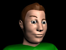
To overcome this problem, a copy of the post-it note style image used in the back navigation button was added to be placed behind each biography, giving the text a canvas on which to be placed. Once the biography text was skewed, the final effect was the one we were after and visually went well with rest of the design components.

The only problem remained that the text was still a little fuzzy and due to its small size, may be unreadable if viewed on small monitors, but for the sake of time restraints we decided this was a minor problem which could be left alone and still give a successful outcome.

I presented my final creation to my team leader, project leader and the rest of the class who all seemed pleased with the outcome, giving mostly positive feedback about the design so I too was pleased in turn.


Tuesday, 27 April 2010

Bio - Third stage - Biography

In this stage of production, the biographies have been added for the majority of the group. Each group member was asked to submit 150-200 words about themselves to e displayed alongside their own images. To ensure each person was aware of the submission of a biography, I created an information sheet stating exactly what was required from each member of the group in order to complete this web page. Also on this sheet was information regarding the photo shoot time and location, which was set up to obtain photographs taken in the same setting in order to produce a sense of conformity in the finished web page, with minimal editing needed.

For the initial design the biographies were placed alongside their photographs, which as can be seen from the image below, did seem to work with the design already set in place. The only flaw was that of the quality of the text in the bio seemed to deteriorate when exported for flash. Many solutions were thought of to overcome this including trying to export from Adobe Illustrator.

It also seemed necessary, for space purposes, to remove the ‘end of year show’ title front the head of the page. Although initially a good design idea, the title was just taking up valuable space needed by the biographies.


Bio - Second stage - Script Editing

Once I had decided on the Flash presentation for the display of the biographies, the next step was to create a design which utilised the space available in the most effective way. In order to do this to my satisfaction, I imported all the necessary components of the page into a Photoshop document and arranged them as a reference plate. The smaller images would be along the bottom with the larger ‘Polaroid’ image shown above. The idea for the design was to display the smaller images at all times with the names appearing as subtitles underneath. This enabled the user move freely between the selections of which biographies to read.


A noticeable change to the layout is the addition of a key legend on the left hand side, showing which colours correspond to each of the teams involved in the exhibition. These colours can be referenced to the overlay tint colour of each person’s image. This was created to show a sense of conformity to the exhibition logo colours and also to give the different photographs a common similarity.

The font for ‘end of year’ was also changed to tie in with the script effect of the names written on the base of the Polaroid images which were given a handwritten effect to add a personal feel to each name against the person they represent.

Other small changes include the movement of the logo slightly and the addition of an interactional ‘Back’ button which will be used to navigate to the previous screen when the website goes live. All change and amendments were shown and approved by my team leader, who gave his blessing for future changes as the design progressed.


Sunday, 21 March 2010

Bio - First stage - Layout Design

As part of the website creation I was delegated with the task of creating the biography page for the main site which would show pictures of the people included in the exhibition as well as short biographies written by each of those involved. I wanted to make the design clean and bold but also conform to the design of the main site which was achieved by the use of the same background and page title.

The hard part to think about was the way in which to display the pictures and bios on the page so that they could be viewed creatively and have enough room to show each person’s own section.


I found the best way to this was to create in Flash, a focal point to display the images alongside their perspective bio pieces, with an underlining sub-visual of each of the people involved in the exhibition. This way all the images would be visible at all times but also each one could be selected individually. Here is the first mock up of the bio page.


You can also notice the logo change between the designs which was a decision made by the team leaders and in my opinion the new logo works better with the design and is more relevant to our theme.

New Website Layout Design


This re-invention of the layout design in my opinion is a cleaner, more artistic take on the visuals needed to portray a design atmosphere. The main body of information will be shown in the bottom right of the display with the title and logo still remaining in their original position. The links will be displayed on the right in the style of post-it notes held on the board background with pins. The font used on the buttons will be in a script style to simulate a handwriting feel. The dates of the exhibition will still be on show but at the bottom instead of top right as before.

The simplicity of this design paired with the use of a strict colour scheme will help be a suitable frame to contain the different styles of work on show in the exhibition.

First Mock Up Design


This was a mock up of a design I put together based on the layout shown above. The design follows all the layout properties of the initial design, with the title at the top and the sponsors on the side which as can be seen, overwhelms the design as previously stated. The design looks alright but I feel it’s too overcrowded and doesn’t follow the theme of the exhibition, which lead to the re-creation of the original design.

Website Design Layout


This was the layout given to me by our team leader and I was given the task to create a layout for the main body of the website. Initial ideas were that the main page was to contain a section for sponsors, the main body of information was to be bordered with the logo design with the title of the exhibition shown at the top along with the contact information. After revision it was decided that having sponsors on the main page was too overwhelming for the design and so was changed to having its own page.